9/26/08

A Book Every Architect Should Reference

There were only a handful of memorable American architects practicing traditional residential architecture during the 1920’s and 1930’s. William Lawrence Bottomley is most assuredly one of the finest talents to practice his craft in that era. Sharing the stage with fellow architects, Mott B. Schmidt, John Calvin Stevens, William Adams Delano, among others, brings Bottomley’s breadth of talent into focus.

Susan Hume Frazer's book The Architecture of William Lawrence Bottomley is to be commended for her thoughtful and extensive research into the life and work of William Lawrence Bottomley. Often overlooked, and under appreciated, are the traditionalists of American architecture such as Bottomley. His skillful detailing and ability to create beautiful buildings is wonderfully illustrated in Frazer’s sumptuous book.

The author provides an in-depth view of how the architect’s personal and professional life intertwined. Although blessed with a sliver spoon at birth Bottomley did not squander his opportunities. Well educated, attending Columbia University and Ecole des Beaux-Arts, traveling throughout Europe to study architecture, and using his social connections, enabled him to build a successful career as an architect with socially prominent clients.

Within the realm of residential design Bottomley’s work provides a sophisticated range in both scale and style. From the smallest of projects such as the Davis family mausoleum (p. 98), to the large country home called Redesdale (p.138), his design styles varied from Georgian, Colonial, Mediterranean, to Art Deco. All beautifully and thoughtfully executed.

Sadly many of the photos are faded, and don’t clearly show off Bottomley's beautiful architectural details, and it is understandable considering the age of the photos and the material the author had to work with. Frazer wisely included floor plans for those seriously interested in studying Bottomley’s designs will appreciate.

A stand-out project which illustrates Bottomley’s exceptional design skills is represented in the “One-Man House” in New York City designed for Benjamin Wood in 1925 (p. 132). A narrow thirteen foot wide row house was remodeled as a collection of spectacularly grand spaces expanding the space vertically with a two story living room. Frazer describes Bottomley’s clever use of false perspective in the garden design to fool the viewer. “Columns and capitals were gradually reduced in size toward the terminus, a diminutive fountain.” (p.134)

Later in life Bottomley designed several apartment buildings one of which was called River House in New York City. In 1930 he moved his family into their own custom designed apartment at River House. Frazer includes the architect’s home in her book weaving in background information about their daughter’s friendship with the bride-to-be of architect I.M. Pei and their subsequent wedding ceremony at the Bottomley apartment. An architect’s home is often a place to take design risks which is illustrated in Bottomley’s Art-Deco eclectic design. Bottomley indulged himself in some whimsical detail that might not otherwise be done for a client. An example being “the stair rail with stylized horse figures cast in brass and alternating with wavy and straight uprights.” (p. 245).

The current generation of architects can learn much from Bottomley’s skill with traditional detailing and proportions, which is often lacking among the profession.

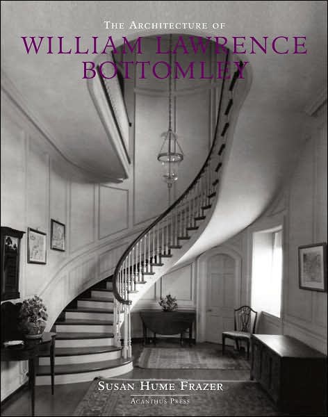
The Architecture of William Lawrence Bottomley. Susan Hume Frazer. New York: Acanthus Press, 2007. 350 pp. $85.00

9/24/08

"A Wish (or two) Come True"

In the Early Spring 2008 issue of Washington Home & Garden you can find an informative article on a recent addition and kitchen remodel by Wentworth, "A Wish (or two) Come True." Featured on page 102 of the print magazine, the article was just released online in the archives.

9/23/08

ASID Award

Wentworth, Inc. is proud to announce a recent kitchen remodel won an Honorable Mention in the Residential Kitchen and Bath category of the Maryland ASID 2008 Interior Design Awards with Chesapeake Home. You can see the project in the October issue of Chesapeake Home.
photo by Ron Blunt

9/19/08

What do a butterfly roof, an island, and a banquette have in common?

Growing families need more and better space. Such was the case for a couple in Bethesda, Maryland with a young child and a baby on the way. Their 1960s Carderock contemporary was attractive, but lacked the modern conveniences that homeowners expect today. In general, it was felt that the kitchen, dining area, and family room were smaller than they needed to be and lacked quality materials.

The original kitchen was a boring box with a door opening to the dining room and one window overlooking the back yard. There was no visual link to the family room. Worn oak veneer cabinets, plastic laminate counter tops, and torn vinyl flooring completed the 1960s era package. The home’s only table space was a small formal dining room barely able to seat six, which prompted their request for a new informal breakfast room. The tired home needed to be updated.

Kitchen Design
A design challenge was to maximize and integrate space in the kitchen with the family room, which required that an existing masonry wall between the kitchen and family room be removed and new structural steel beams/columns installed to open the space. The new enlarged kitchen layout accommodates an island with bar stools and maximizes the remaining space. A new 42” high built-in cabinet with frosted glass doors was installed that provides storage at the dining room side. Throughout the kitchen flush-front teak cabinets provide a modern lean look with a color contrast provided by the black-honed granite countertops. At the client’s request, a palette of earth-tones colors were selected for the glass tile backsplash. Three pendant light fixtures with orange tinted glass were installed above the island.

New Breakfast Room
A new breakfast room addition was designed with floor to ceiling glass on three sides that maximizes sight lines from lawn to tree top views. The new roof slopes upward toward the trees forming what is called a “butterfly” roof. The butterfly roof fits beautifully with the 1960s contemporary style architecture. The lady-of-the-house had a desire for a banquette, which was satisfied by a custom upholstered “L” shaped bench and table. We specified a special Crypton fabric which is impervious to staining. A simple table clad in Formica is lit by a large hanging fixture with a fabric shade, which forms a cozy space with a sense of closure and ample garden views.

Expanded Family Room
The clients felt that the existing family room was too small and that it was important to enlarge the space. Fortunately, the house had a 4’ wide roof overhang running along the rear wall of the family room. Capturing this additional 4’ of space for the interior made it possible to enlarge the existing family room without altering the roof. A new structural beam provides the roof support the former wall provided, and it allows for the new opening into the breakfast room addition.

Oak Flooring
It was agreed that using oak flooring throughout the remodeled space was important to unify the design. The existing family room had wide plank & peg oak flooring, but the other parts of the house had standard strip oak flooring, and the integration of the two proved tricky. To solve this problem, the design team chose to run a wide walnut border around the existing plank & peg floor that defined it and offered an honest transition to the standard oak floor used in the addition and kitchen. An added benefit of the walnut border was the ghost-like outline of the original wall locations (a respectful nod to the past structure).

Media Center, Dry Bar, and Mud Room.
A focal point of the new family room is the custom bookcase with media center, flat screen TV, and bookshelves. Equipment is housed within the lower portion of the bookcase and, when the TV is not in use, it blends unobtrusively into the surroundings. The new bookcase is centered on the family room wall opposite the kitchen. Flanking the bookcase, and somewhat tucked behind it, are the new dry bar and mud room. Unobtrusively nestled into a leftover corner of the family room is the new dry bar. Dark espresso cabinets provide storage for the owner’s barware collection and a stone countertop harmonizes with the kitchen. Located at the opposite end of the built-in bookcase is a new mudroom that efficiently acts as a hub leading to the rear garden, basement stair, and garage. The new mudroom was fitted-out with bench, cubbies for storage, and hooks for coats. A tile floor accommodates wet feet and the space was maximized for a family with children.

The new design brings together a butterfly roof at the new breakfast room with a custom banquette, and a new kitchen island to create a whole new home environment. The new remodel and addition fit seamlessly into the older home and is successful functionally and aesthetically. Every detail was considered, while every problem was solved and beautifully executed, resulting in happy homeowners and clients.
photos by Ron Blunt

9/18/08

Wentworth Featured in September Hill Rag


Recently Wentworth, Inc. gained editorial coverage in the local Hill Rag's September issue. Both articles were part of their Home & Garden Special feature.


You will find an informative article by Architect Bruce Wentworth on a recent bath project we completed, "A Guest Bath with Panache." Bruce uncovers the secrets to renovating an outdated attic bath in to a luxurious and timeless guest bath.


Also, Marketing Specialist Candice Carver, authored "DC's Urban Eden" on a great garden/outdoor living space in NW Washington DC.

9/16/08

Charles and Hudson

We would like to thank Charles and Hudson for mentioning Ask the Architect on their website yesterday who we found in the Picks to Click feature in The Washington Post Home Section.

"Based in NYC and established in 2005 by Timothy Dahl, Charles and Hudson is an independent resource for do-it-yourself enthusiasts who seek the latest tools, techniques, and designs for home renovation and remodeling."

9/15/08

Professional Remodeler:Best of the Best Design Awards 2008


Wentworth, Inc. is proud to announce we have won a Bronze Best of the Best Design Awards 2008 in the Residential Bathroom under $50,000 category.

Now in its seventh year, the Best of the Best Design Awards competition recognizes outstanding design, craftsmanship and functionality in the projects of remodelers across the United States. The judging panel included remodelers, architects and kitchen and bath designers.

Winning projects will be featured in the December issue of Professional Remodeler.
photo by Ron Blunt

9/11/08

Maximizing space in your townhouse

When you have a small townhouse and a growing family, it’s important to maximize your space. Homeowners often assume they need to add space to their homes when, in fact, more intelligent use of their existing space can satisfy their needs. That was the case for our client, an attorney with a DC firm, who recently welcomed their second child to their three-story, 13’ wide, townhouse. Like many townhouses, the formal living room is located on the second floor, and they felt it was too remote from their kitchen/dining for a growing family. Eager to replace their outdated kitchen, the clients challenged our design/build team to reconfigure their space to accommodate living, dining, and kitchen on one floor allowing the existing second floor living space to be utilized as a child’s playroom.

The existing conditions were not ideal because the first floor was inefficiently arranged in the 1980’s remodeling. The first floor entry hall was 54” wide and ran parallel to a 12’ long enclosed kitchen. Giving up space to a large entry hall, and preparing meals in a walled-off kitchen was not conducive to their family’s lifestyle.

Just beyond the kitchen, at the center of the house, is a staircase that links the three floors. Unfortunately a 7’ x 8’ space devoted to circulation was wasted in front of the stairwell. In a larger home the space could be called the “stair hall” but in a small house every bit of space needs to be functional. In the 1980’s the home’s staircase had been poorly remodeled with stair risers that were not equal, loose treads, and an inferior railing. Our carpenters completely rebuilt the stair with new oak risers, treads, and a handsome new oak railing. As the centerpiece of the home it was important to make the stair safe and attractive.

Beyond the stair hall, overlooking the garden was a “sunken” dining room, one step-down. The step-down into the dining room made it difficult to place furniture, was not flexible in terms of its use, and was a potential tripping hazard. These were the conditions that faced the design/build team.

To maximize space the entire first floor was gutted and reconfigured to suit the new design and accommodate living, dining and kitchen on one floor. The existing compartmentalized kitchen was replaced with a new open plan that is more efficient and attractive. The new kitchen is arranged with all appliances and pantry on an exterior wall. Because space is limited a stack washer and dryer were accommodated in the kitchen along with the range and refrigerator. A new kitchen island accommodates the sink and dishwasher, and acts as a food prep area. The island’s elongated shape terminates in a custom built-in dining table with a drop leaf that normally seats four but can seat six when expanded. The island, combined with the custom built-in dining table, form a sculptural unit that is both aesthetic and functional. Removing the interior walls provided extra space which also allowed our designers to place a row of 12” deep, floor-to-ceiling, storage cabinets. A chalkboard surface is framed by the wall of cabinets where the family can leave messages or the children can practice their drawing skills. Black honed-granite countertops, maple cabinets, and bamboo flooring set an elegant and spare tone for the first floor. A glass tile backsplash of bottle green, in a brick pattern, provide a dash of sparkle.

The rear portion of the first floor was an under-utilized dining room, one-step down from the kitchen, and difficult to furnish. The design/build team raised the floor to make it contiguous with the existing floor level. The former dining room became the new informal adult/media/family room. To maximize the space custom built-in storage was designed for both sides of the room. One wall is equipped with a flat screen TV and speakers that are set into a wall niche. Electronic equipment is easily accessible and tastefully placed on open shelving in a recessed niche with a cabinet below that conceals additional equipment. The opposite wall has a custom crafted bookcase with closed storage below, and open, adjustable, shelving above. The Wentworth interiors group was able to utilize their design skills by specifying custom furniture for the new family room. Although the space is small, it accommodates two upholstered swivel tub chairs, and two upholstered slipper chairs, each with side tables, that provides a comfortable space to relax.

With thoughtful design, and attention to detail it is possible to maximize your existing space. By carefully planning your home’s space arrangement, utilizing built-in units for storage, and keeping your possessions minimal your home can be attractive and functional. After this recent remodeling the home will suit their growing family for years to come.

photos by Ron Blunt

9/5/08

Curb Appeal

The homes along the North Quaker Lane area of Alexandria are beautiful and spacious. This was the case for our clients whose property is gorgeous and has a wonderful interior; the one exception being that their home lacked curb appeal. Our design team recommended focusing the effort and dollars to upgrade the entry porch and improve the home’s street presence. The existing covered porch was uninviting, narrow and felt like a back door. Exposed brick walls at the porch looked rough and unrefined, old stone paving was cracked and loose, and a pair of glass patio doors served as the front entry but lacked ‘front-door’ status.

This project was all about the details; the details of the architecture and the details of the arrival experience. Starting your journey at the driveway we constructed low stone square piers to announce the new flagstone sidewalk; each pier capped with thick flagstone for a substantial feeling, and built-in lighting illuminates the step. The sidewalk’s flagstone was laid in a diagonal pattern to create a rhythm as you progress parallel to the front of the house. Arriving at a turning point, the walk widens to a square and the paving pattern changes, designating its time to turn and face the porch. To make the porch feel more inviting the flagstone paving was extended beyond the porch roofline. This extra floor space allows visitors to gather and accommodates porch accessories such as benches or decorative pots.

The new sidewalk delivers the visitor to the center of the porch so that you must walk through the porch to the front door and experience the space. The porch offers a new experience because the brick walls of the porch are covered with wood paneling with panel molding. Three different wall panel designs were proposed, ranging from formal (raised panels) to informal (vertical T&G boarding). Each style was mocked-up life size for the client to examine and the design selected was the flat recessed panel with panel molding which was chosen because it is not too formal and not too informal. The fake shutters were removed from at the porch windows and door to let the paneling do its work. New trim at the door and windows further enhances the details. The old glass patio doors were replaced with an elegant custom door flanked by sidelights that gives the house a new status.

The home’s new curb appeal puts it in sync with the quality of the overall residence and enhances its market value.
photo by Ron Blunt

9/4/08

Washington Spaces Award Winner

Wentworth, Inc. is proud to announce a recent basement remodel won an Outstanding Award in the Washington Spaces 2008 Design Competition: Best of Architectural Spaces. You can see the article in the Fall 2008 Issue on page 74.