Showing posts with label Wentworth Inc. Show all posts
Showing posts with label Wentworth Inc. Show all posts
2/18/11
A Wentworth, Inc. Kitchen Remodel in Today's Daily 5 Remodel!
Here at Wentworth, Inc. we were excited to see one of our recent kitchen remodel projects featured in today's Daily5 Remodel! This Chevy Chase, MD kitchen remodel is also a 2010 National Association of the Remodeling Industry Metro DC Chapter CotY winner. Check out the great feature here.


5/5/10
A Dedicated Staff of Carpenters
Education is Important. At Wentworth we encourage staff to attend events where they can learn to be better remodelers for our clients. Our Production Manager, Steven Barnard, is especially keen on these opportunities and for the second year in a row attended the JLC Live Residential Construction Show in Providence, Rhode Island March 20-21, 2010, along with our carpenters Yonal De La Rosa and Tim Haigh.
 Organized by the magazine, Journal of Light Construction, the show features useful information about products, tools and techniques. Hands-on building clinics and classroom education round out the hundreds of product display booths. JLCLive prides itself on being the leading construction event serving the residential sector bringing construction professionals face-to-face with manufactures, distributors and service providers while providing education through live, interactive demonstrations, and a comprehensive conference program.
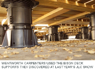
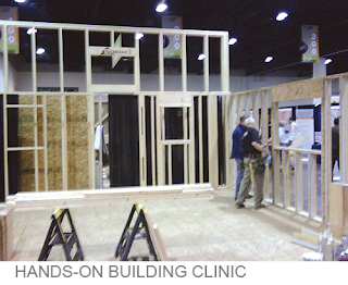 In 2009, while attending the JLCLive show, our
 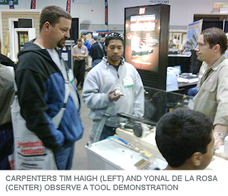 production manager discovered a new product, Bison Deck Supports, which provides variable height roof deck supports for pre-made IPE wood decking tiles. Wentworth utilized this product for a remodeling project in Northwest Washington, DC. Sure evidence that the time was well invested.

Dedication to continual improvement and training allow the Wentworth staff to excel in our construction services; A true benefit for our remodeling clients.
To see more of this project visit our website at www.wentworthstudio.com
 Residential Construction Show in Providence, Rhode Island March 20-21, 2010, along with our carpenters Yonal De La Rosa and Tim Haigh.
 Organized by the magazine, Journal of Light Construction, the show features useful information about products, tools and techniques. Hands-on building clinics and classroom education round out the hundreds of product display booths. JLCLive prides itself on being the leading construction event serving the residential sector bringing construction professionals face-to-face with manufactures, distributors and service providers while providing education through live, interactive demonstrations, and a comprehensive conference program.
 In 2009, while attending the JLCLive show, our
 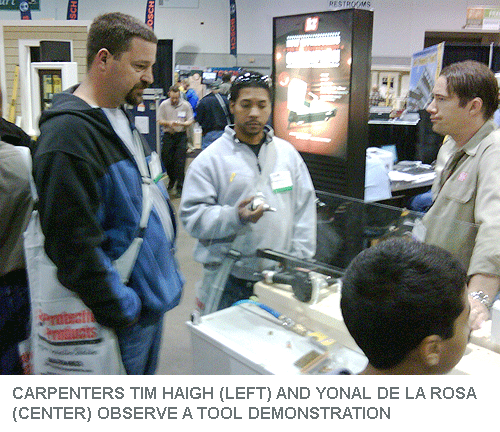 production manager discovered a new product, Bison Deck Supports, which provides variable height roof deck supports for pre-made IPE wood decking tiles. Wentworth utilized this product for a remodeling project in Northwest Washington, DC. Sure evidence that the time was well invested.

Dedication to continual improvement and training allow the Wentworth staff to excel in our construction services; A true benefit for our remodeling clients.
To see more of this project visit our website at www.wentworthstudio.com
4/8/10
Prioritizing Your Home Remodeling Projects
 By Bruce Wentworth, AIA
Homeowners are budget conscious when making home remodeling decisions. Wentworth can help you make these often difficult or confusing decisions at an in-home consultation, where priorities, design concepts, and construction issues can be clarified. Budget-minded simply means allocating financial resources in the best possible way. Excellent design solutions, coupled with quality craftsmanship and materials, are still a smart long-term home investment.


A well-located Washington area home remains a solid investment. After three decades in business, I can offer these tips to improve home value.
1. Kitchens: Kitchens more than 25 years old are functionally obsolete and aesthetically outdated. A well-designed kitchen enhances home value and improves family life.
2. Bathrooms: A well-designed master bath is an excellent investment, although cosmetically upgrading older baths will also improve home value.
3. Facades: If your home lacks curb appeal, exterior façade enhancements will add value. A new front door, windows, a front porch, or other architectural embellishments, all sensitive to your home’s architectural style, can be considered.
Thoughtful design analysis of your home makes appropriate, cost-effective remodeling decisions a reality. Call for a consultation today 240-395-0705 x 100.
10/19/09
Master Design Award Winner

2009 (Fort Atkinson, WI)- Wentworth, Inc. has been named a winner in the prestigious 31st Annual Qualified Remodeler (QR) Master Design Awards Contest. Wentworth, Inc. won GOLD in the Kitchen >$100,000 category.
Sponsored by Qualified Remodeler magazine, the Master Design Awards is the premier national contest recognizing outstanding achievement in residential remodeling projects in 22 categories. For information visit www.qualifiedremodeler.com.
 About the Winning Project
A 1880s, end-unit, brick row house was desperately in need of a new kitchen. The old kitchen had been poorly remodeled in the 1970s and required a complete gutting to the brick walls and floor joists. The homeowners desired a new kitchen that took advantage of views into a newly landscaped rear garden, created a breakfast bar for two, an area for laptops with mail cubbies, and opened the wall between the new kitchen and dining room to make their home more suited to informal living. A rear door was relocated and made taller to suit the new cabinet layout and take-in garden views.
Challenges of this Project
The poor conditions required new framing to make the walls plumb & square, and the narrow space (11’-4” x 14’) required a careful design. The south wall has 12” deep, full height cabinets flanking a counter. A north wall accommodates all appliances, sink, and new casement window. Tight cabinet conditions required that the new rear door be repositioned which also helped with garden views.
Creative Solutions

Careful design accommodates a center island. A cherry counter top distinguishes the island from the adjacent stone countertops. Pendant lighting accents the island and leads the eye to the garden. A 12” deep wall of pantry cabinetry flanks a counter top used for laptops, mail cubbies, and cell phones. The symmetrical design is reinforced with a custom coffered-beam ceiling that accentuates the height and gives panache to an informal space.
Project Results
The overall results are exceptionally well suited to the modestly scaled historic row house. The living spaces now flow front to back – with the kitchen acting as the link to the rear garden and completes the home’s living space. Although a small scale house it now feels spacious. The new kitchen utilizes carefully planned, upscale detailing, that gives the home a sense of understated, practical luxury. All is appropriate.
Creative Solutions
Careful design accommodates a center island. A cherry counter top distinguishes the island from the adjacent stone countertops. Pendant lighting accents the island and leads the eye to the garden. A 12” deep wall of pantry cabinetry flanks a counter top used for laptops, mail cubbies, and cell phones. The symmetrical design is reinforced with a custom coffered-beam ceiling that accentuates the height and gives panache to an informal space.
Project Results
The overall results are exceptionally well suited to the modestly scaled historic row house. The living spaces now flow front to back – with the kitchen acting as the link to the rear garden and completes the home’s living space. Although a small scale house it now feels spacious. The new kitchen utilizes carefully planned, upscale detailing, that gives the home a sense of understated, practical luxury. All is appropriate.

6/2/09
A Custom Painted Floor
By Bruce Wentworth, AIA
Painting your wood floors is a wonderful way to give your home variety and create a custom look. If you keep it simple it can be a cost effective way to enhance your old wood floors. If you want a more refined, detailed look it will cost a bit more.
A recent design problem involved oak floors for a kitchen and adjacent dining room. The kitchen was being remodeled with a new 9’ wide opening to visually link the dining room and gain natural light from the south facing room. Custom mahogany cabinets, and dark gray limestone counter tops, were a dressy touch for the new kitchen. The design dilemma was how to handle the wood floor finish. The homes’ existing oak floor had a medium dark stain - but continuing the stain color into the kitchen did not provide visual contrast with the cabinets; it would have been muddy. And changing to a lighter stain would have looked odd against the existing dark oak floors. Solution: paint the wood floor. Paint provided a natural break from the existing stained oak floors, and a color compliment to the new kitchen cabinets.Of course, once paint was selected we had to decide upon the color and pattern. Without too much agony, a light gray neutral color was selected because it worked well with the gray limestone counter top and complemented the mahogany cabinets. I was fortunate to know Maxine Cohen who had experience with painted floors. I knew that painting a monolithic gray would not suffice – so with the idea of a two-tone gray floor, I prepared several drawings with subtle striated patterns.
Conceptually it is a rectilinear pin wheel; a small rectangle, in a solid gray, placed as the center of the pinwheel, around which a large rectangle and a large square are placed. The square and the rectangle are differentiated by the differing widths of their stripes.
 The pattern creates a gentle visual movement on the floor and never feels dead. Maxine made three test mockups to get it just right and cleverly cut rubber squeegees with different size slots (like combs) to create the stripped patterns. It worked like a charm…but took seven days to paint. The long days of taping the pattern, painting, and letting it dry to implement the detailed design was worth it - as the evidence shows.


Painting your wood floors is a wonderful way to give your home variety and create a custom look. If you keep it simple it can be a cost effective way to enhance your old wood floors. If you want a more refined, detailed look it will cost a bit more.
A recent design problem involved oak floors for a kitchen and adjacent dining room. The kitchen was being remodeled with a new 9’ wide opening to visually link the dining room and gain natural light from the south facing room. Custom mahogany cabinets, and dark gray limestone counter tops, were a dressy touch for the new kitchen. The design dilemma was how to handle the wood floor finish. The homes’ existing oak floor had a medium dark stain - but continuing the stain color into the kitchen did not provide visual contrast with the cabinets; it would have been muddy. And changing to a lighter stain would have looked odd against the existing dark oak floors. Solution: paint the wood floor. Paint provided a natural break from the existing stained oak floors, and a color compliment to the new kitchen cabinets.Of course, once paint was selected we had to decide upon the color and pattern.
 Without too much agony, a light gray neutral color was selected because it worked well with the gray limestone counter top and complemented the mahogany cabinets. I was fortunate to know Maxine Cohen who had experience with painted floors. I knew that painting a monolithic gray would not suffice – so with the idea of a two-tone gray floor, I prepared several drawings with subtle striated patterns.
Conceptually it is a rectilinear pin wheel; a small rectangle, in a solid gray, placed as the center of the pinwheel, around which a large rectangle and a large square are placed. The square and the rectangle are differentiated by the differing widths of their stripes.
 The pattern creates a gentle visual movement on the floor and never feels dead. Maxine made three test mockups to get it just right and cleverly cut rubber squeegees with different size slots (like combs) to create the stripped patterns. It worked like a charm…but took seven days to paint. The long days of taping the pattern, painting, and letting it dry to implement the detailed design was worth it - as the evidence shows.
4/9/09
The Luxury of Space

 By Bruce Wentworth, AIA
 ing a Master Bathroom. The happy homeowner’s are a couple with two small children and a spacious townhouse.
Their circa 1980s home needed an updated master bathroom that utilized the existing space properly and took advantage of a spectacular city view from its fourth floor vantage. Although the existing bath’s space was ample, it was inefficiently arranged, cheaply built, and lacked the aesthetic appeal desired by the homeowner.
The space had several challenges. A south facing wall of glass included a large window and sliding-glass door that lead to a narrow balcony. The spectacular view from the fourth floor bathroom was sacred, but lacked privacy and suffered from hot southern sun. Additionally, there was too much space to properly place all of the bathroom functions in one room adjacent to a wall of glass. Sensible design required that the bath be reconfigured and zoned for functionality.

The design team agreed that the new layout would have ‘public’ and ‘private’ spaces to be more practical. The public space, opening onto the master bedroom with double doors, was placed near the window wall with a free-standing sculptural tub so bathers can enjoy the city view. A double-sink vanity, furniture-like with a mirror and over-mantle feature, provides an aesthetic and functional focal point. The large wall visible upon entering the space was enhanced with applied panel moldings and two tone paint colors. The public area’s ample space also accommodates an upholstered bench and a cheval glass mirror. The simple arrangement and ample space feel luxurious. Privacy and sun control are provided for with a wall of sliding louvered panels.
 The bath’s smaller, private space was placed behind a new wall. Separated from the public space, by a frosted-glass pocket door, this smaller private area accommodates the toilet and a large walk-in shower stall with a built-in bench. Large scale porcelain wall tile and horizontal bands of glass mosaic wall tile enhance the shower. Linked to this private space is an existing ample sized walk-in closet that allows the homeowner to exit to their bedroom.
Success is measured with a happy client. Aesthetically and functionally the master bath has changed their home for the better. The project is a testament to the importance of a good space plan zoned with public and private spaces. Where else can a homeowner enjoy a view of the
Bruce Wentworth, AIA, an architect and contractor, is the founder of Wentworth, Inc. a residential design-build firm offering architecture, interiors and construction. 240-395-0705 x 100. www.wentworthstudio.com
9/19/08
What do a butterfly roof, an island, and a banquette have in common?
 Growing families need more and better space. Such was the case for a couple in Bethesda, Maryland with a young child and a baby on the way. Their 1960s Carderock contemporary was attractive, but lacked the modern conveniences that homeowners expect today. In general, it was felt that the kitchen, dining area, and family room were smaller than they needed to be and lacked quality materials.
 The original kitchen was a boring box with a door opening to the dining room and one window overlooking the back yard. There was no visual link to the family room. Worn oak veneer cabinets, plastic laminate counter tops, and torn vinyl flooring completed the 1960s era package. The home’s only table space was a small formal dining room barely able to seat six, which prompted their request for a new informal breakfast room. The tired home needed to be updated.
 Kitchen Design
A design challenge was to maximize and integrate space in the kitchen with the family room, which required that an existing masonry wall between the kitchen and family room be removed and new structural steel beams/columns installed to open the space. The new enlarged kitchen layout accommodates an island with bar stools and maximizes the remaining space. A new 42” high built-in cabinet with frosted glass doors was installed that provides storage at the dining room side. Throughout the kitchen flush-front teak cabinets provide a modern lean look with a color contrast provided by the black-honed granite countertops. At the client’s request, a palette of earth-tones colors were selected for the glass tile backsplash. Three pendant light fixtures with orange tinted glass were installed above the island.
 New Breakfast Room
A new breakfast room addition was designed with floor to ceiling glass on three sides that maximizes sight lines from lawn to tree top views. The new roof slopes upward toward the trees forming what is called a “butterfly” roof. The butterfly roof fits beautifully with the 1960s contemporary style architecture.
 The lady-of-the-house had a desire for a banquette, which was satisfied by a custom upholstered “L” shaped bench and table. We specified a special Crypton fabric which is impervious to staining. A simple table clad in Formica is lit by a large hanging fixture with a fabric shade, which forms a cozy space with a sense of closure and ample garden views.
 Expanded Family Room
The clients felt that the existing family room was too small and that it was important to enlarge the space. Fortunately, the house had a 4’ wide roof overhang running along the rear wall of the family room. Capturing this additional 4’ of space for the interior made it possible to enlarge the existing family room without altering the roof. A new structural beam provides the roof support the former wall provided, and it allows for the new opening into the breakfast room addition.
 Oak Flooring
It was agreed that using oak flooring throughout the remodeled space was important to unify the design. The existing family room had wide plank & peg oak flooring, but the other parts of the house had standard strip oak flooring, and the integration of the two proved tricky. To solve this problem, the design team chose to run a wide walnut border around the existing plank & peg floor that defined it and offered an honest transition to the standard oak floor used in the addition and kitchen. An added benefit of the walnut border was the ghost-like outline of the original wall locations (a respectful nod to the past structure).
 Media Center, Dry Bar, and Mud Room.
A focal point of the new family room is the custom bookcase with media center, flat screen TV, and bookshelves. Equipment is housed within the lower portion of the bookcase and, when the TV is not in use, it blends unobtrusively into the surroundings. The new bookcase is centered on the family room wall opposite the kitchen. Flanking the bookcase, and somewhat tucked behind it, are the new dry bar and mud room. Unobtrusively nestled into a leftover corner of the family room is the new dry bar. Dark espresso cabinets provide storage for the owner’s barware collection and a stone countertop harmonizes with the kitchen. Located at the opposite end of the built-in bookcase is a new mudroom that efficiently acts as a hub leading to the rear garden, basement stair, and garage. The new mudroom was fitted-out with bench, cubbies for storage, and hooks for coats. A tile floor accommodates wet feet and the space was maximized for a family with children.
 The new design brings together a butterfly roof at the new breakfast room with a custom banquette, and a new kitchen island to create a whole new home environment. The new remodel and addition fit seamlessly into the older home and is successful functionally and aesthetically. Every detail was considered, while every problem was solved and beautifully executed, resulting in happy homeowners and clients.
 The new design brings together a butterfly roof at the new breakfast room with a custom banquette, and a new kitchen island to create a whole new home environment. The new remodel and addition fit seamlessly into the older home and is successful functionally and aesthetically. Every detail was considered, while every problem was solved and beautifully executed, resulting in happy homeowners and clients.
 photos by Ron Blunt
9/18/08
Wentworth Featured in September Hill Rag

Recently Wentworth, Inc. gained editorial coverage in the local Hill Rag's September issue. Both articles were part of their Home & Garden Special feature.
You will find an informative article by Architect Bruce Wentworth on a recent bath project we completed, "A Guest Bath with Panache." Bruce uncovers the secrets to renovating an outdated attic bath in to a luxurious and timeless guest bath.
Also, Marketing Specialist Candice Carver, authored "DC's Urban Eden" on a great garden/outdoor living space in NW Washington DC.
Subscribe to:
Posts (Atom)

 Posts
Posts


